How it all begun.
Key concepts: Keeling curve. Climate Sensitivity. Carbon Budget. Origin of anthropogenic CO2 emissions. The Age of the Great Acceleration.
It all started with the Industrial Revolution at the beginning of the 19th century.
Since the Industrial Revolution, global temperatures have risen by almost 1.5°C above pre-industrial levels in just 150 years. As illustrated in the accompanying slides covering the past 1,000 years, increases in atmospheric CO2 levels—now exceeding 426 ppm as of June 2024—are closely correlated with rising temperatures.
![[ Source: Rand Air-Compressor (engraving) by English School, (19th century); Private Collection; (add.info.: Rand Air-Compressor.); Look and Learn / Valerie Jackson Harris Collection; English, out of copyright.]](https://www.refreezethearcticfoundation.com/wp-content/uploads/2026/04/H1_fig01-300x169.png)
[ Source: Rand Air-Compressor (engraving) by English School, (19th century); Private Collection; (add.info.: Rand Air-Compressor.); Look and Learn / Valerie Jackson Harris Collection; English, out of copyright.]
![[ Source: https://www.co2levels.org and https://nl.wikipedia.org/wiki/Hockeystickcurve#/media/Bestand:Mann_hockeystick.jpg under creative commons license: http://CreativeCommons.org/licenses/by/4.0/ ]](https://www.refreezethearcticfoundation.com/wp-content/uploads/2026/04/H1_fig02-300x169.png)
[ Source: https://www.co2levels.org and https://nl.wikipedia.org/wiki/Hockeystickcurve#/media/Bestand:Mann_hockeystick.jpg under creative commons license: http://CreativeCommons.org/licenses/by/4.0/ ]
In recent decades, Keeling and colleagues have recorded this astonishing rise in atmospheric CO2 levels at the Mauna Loa Observatory, Hawaii. Today, CO2 levels are 50% higher than in 1800, at the start of the industrial revolution, with most of the increase occurring in the past 50 years. This rise shows no signs of slowing down.
![[Ref.: the Scripps CO2 Program – Scripps Institution on Oceanography, UC San Diego under creative commons license: http://CreativeCommons.org/licenses/by/4.0/ ] https://scrippsco2.ucsd.edu](https://www.refreezethearcticfoundation.com/wp-content/uploads/2026/04/H1_fig03-300x165.png)
[Ref.: the Scripps CO2 Program – Scripps Institution on Oceanography, UC San Diego under creative commons license: http://CreativeCommons.org/licenses/by/4.0/ ] https://scrippsco2.ucsd.edu
What causes the seesaw in the Keeling Curve? They result from Earth’s natural photosynthesis and CO2 absorption/emission cycles. Conversely, the rise in the curve is primarily driven by anthropogenic greenhouse gas emissions. NASA has effectively modelled these combined effects. On current trend, the net effect is a +2 ppm CO2 increase per year: NASA SVS — CO2 Waterfall video.
![[Ref.: the Scripps CO2 Program – Scripps Institution on Oceanography, UC San Diego under creative commons license: http://CreativeCommons.org/licenses/by/4.0/ ]](https://www.refreezethearcticfoundation.com/wp-content/uploads/2026/04/H1_fig04-300x167.png)
[Ref.: the Scripps CO2 Program – Scripps Institution on Oceanography, UC San Diego under creative commons license: http://CreativeCommons.org/licenses/by/4.0/ ]
Scientists have now reconstructed Global CO2 concentrations dating back millions of years.
CO2 concentrations of 426 ppm haven’t been seen in the past 800,000 years. The last time levels were above 400 ppm was about 4 million years ago, during the Pliocene epoch, when sea levels were 25 meters higher than today (due to the global mean temperature then being about 4.0°C higher than today’s pre-industrial level: https://doi.org/10.1029/2024AV001356).
During the last 10,000 years, in the Holocene, CO2 concentrations stabilized around 270 ppm, leading to small and gradual temperature variations. This relatively benign climate allowed humans to develop agriculture and become the dominant species on Earth. However, this stable climate is now coming to an end. Global temperatures are rising rapidly due to the anthropogenic increase in greenhouse gas concentrations that began with the Industrial Revolution.
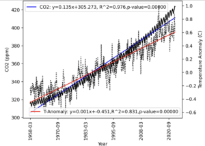
Graph is taken from: “Black box analysis with linear regression on global warming” – Yoshiyasu Takefuji – Faculty of Data Science, Musashino University, 3-3-3 Ariake Koto-ku, Tokyo 135-8181, Japan
As show in the above graph, there is a convincingly strong correlation between the rise in global temperature (called ‘Temperature Anomaly’, represented by the wide scatter plot and red regression line on the right y-axis) and the increase in atmospheric CO2 -concentrations (represented by the Keeling curve and blue regression line on the left y-axis). Scientific rigor requires acknowledging that even a very strong correlation does not, by itself, demonstrate a causal relationship.
What causes the increase in atmospheric CO2 levels?
The 50% increase in atmospheric CO2 since pre-industrial times is attributed to burning fossil fuels. This conclusion is supported by several key observations:
Quantitative Correlation: There is a closed budget between the production of CO2 due to fossil emissions and land-use change on the one hand and the uptake of CO2 by the atmosphere, the land and the oceans.
Causal effect: the process by which CO2 and other GHGs warm the atmosphere has been elucidated and quantified. GHGs selectively absorb infrared radiation (see II., III. and IV.)
Satellite Tracking: nowadays, satellites track CO2 emission sources, allowing NASA and other research institutions to accurately model the atmospheric CO2 cycle (see I.). These models consistently point to human activities as the primary source of the extra CO2.
Carbon Isotope Analysis: satellites have measured the carbon isotopes composition of atmospheric CO2. This composition has an increased content in C12-isotope, typically found in vegetation, alive, dead or… fossilized. This composition unequivocally – a word rarely used by the IPCC – indicates that the increase is due to fossil fuel combustion. For a detailed explanation, Simon Clark covers this topic in his podcast: https://www.youtube.com/watch?v=sg6-_6crLlM
Further observations confirm the impact of increasing atmospheric CO2 concentrations on our planet’s environmental balance:
Our oceans are acidifying at an alarming rate, consistent with a rapid increase in atmospheric CO2 concentration (see IV. Our oceans act as heat sinks and carbon sinks.).
Our stratosphere is cooling (!). Stratospheric cooling can only be explained by global warming that is caused by an increase in atmospheric CO2 concentration (see XI.). Stratospheric cooling due to greenhouse gas emissions was predicted in 1967, long before global warming became a household subject.

[Ref.: Information from Paleoclimate Archives This chapter should be cited as: Masson-Delmotte, V., M. Schulz, A. Abe-Ouchi, J. Beer, A. Ganopolski, J.F. González Rouco, E. Jansen, K. Lambeck, J. Luterbacher, T. Naish, T. Osborn, B. Otto-Bliesner, T. Quinn, R. Ramesh, M. Rojas, X. Shao and A. Timmermann, 2013: Information from Paleoclimate Archives. In: Climate Change 2013: The Physical Science Basis. Contribution of Working Group I to the Fifth Assessment Report of the Intergovernmental Panel on Climate Change [Stocker, T.F., D. Qin, G.-K. Plattner, M. Tignor, S.K. Allen, J. Boschung, A. Nauels, Y. Xia, V. Bex and P.M. Midgley (eds.)]. Cambridge University Press, Cambridge, United Kingdom and New York, NY, USA. ]
[Ref.: IPCC Sixth Assessment Report Working Group 1: The Physical Science Basis]
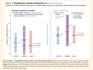
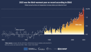
As shown in the graph above, climate sensitivity remains a topic of intense debate. Yet, over the years, climate sensitivity estimates have remained remarkably constant at a value of around 3°C and with a reduction of the uncertainty of this number. With the benefit of hindsight provided by the Keeling Curve reaching back to the Pliocene, it is evident that such a temperature increase would constitute a planetary disaster.Although climate is formally defined using 30-year averages, observed global warming over the most recent decade (2015–2024) has been estimated at about 0.27 °C per decade, a rate higher than in previous decades. This accelerated warming is driven by a combination of record-high greenhouse gas emissions, averaging 53.6 ¬± 5.2 Gt CO2e per year over 2014–2023, and a reduction in aerosol-related cooling (Forster et al., 2025, ESSD). By comparison, global greenhouse gas emissions in the 1970s were around 30 Gt CO2e per year. Additional factors contributing to short-term variability include heat uptake by the oceans and interactions involving clouds (for an in-depth discussion, check out IV. A quantification of energy fluxes).
Recently, a team led by climatologist extraordinaire J. Hansen settled on a climate sensitivity value of 4.5°C, which is on the higher end of valuations. Their estimate relies more on recent observations than on computer models. According to their latest study, the “2°C target is dead” because global GHG emissions are still rising. The analysis predicts that global warming will likely reach 2°C by 2045(!) unless solar geoengineering is implemented. (Hansen, J. et al. (2025). Global Warming Has Accelerated: Are the United Nations and the Public Well-Informed? Environment: Science and Policy for Sustainable Development, 67(1), 6–44. doi.org/10.1080/00139157.2025.2434494)
If the current emission rates were to persist, global mean temperature would likely exceed an equally disastrous 2 °C above preindustrial levels before 2050, unless rapid and substantial reductions in CO2 emissions are achieved in the coming years.

How much CO2 can we still emit before global warming spirals out of control? The concept of carbon budget tries to answer this question. In the above graph, various carbon budgets are illustrated, together with the probability – not the certainty – of containing global warming to say 1.5°C or 2°C above pre-industrial levels (source: Zeke Hausfather, June 26 2023, https://www.theclimatebrink.com/p/the-rapidly-shrinking-carbon-budget).
To remain below 1.5°C with a fair probability of 66%, we must dramatically cut CO2 emissions to zero(!) within the next 10 years (green line). This is mission impossible. But so is remaining below 1.5°C with a mere fifty-fifty chance of success (blue line). The 1.5°C cap is no longer practically achievable.
Given more time, staying below a deeply worrying 2°C has a better chance of success (orange and red lines), provided we start dramatically cutting emissions TODAY. This is not happening. At best, in the coming years, emissions will stabilize at today’s very high levels (for economic and societal incentives to break out of this frustrating status quo check out Chapter XIII. Economic cost of global warming). As discussed in the introductory napkin diagram, postponing drastic emission cuts until “later” carries the existential – and therefore unacceptable – risk of “overshoot” and crossing critical tipping points that could lead to uncontrollable global warming.
Containing global warming below 2°C by 2050 now seems out of reach too. In fact, there is a more than 70% probability that global warming will exceed 2°C – 4°C by 2100 (see Chapter X. How to beat the odds). Unless, unless, unless… massive deployment of solar radiation management (SRM) comes to the rescue.
Please note that in the above graph, CO2 emissions are on the y-axis. However, it is better to refer to CO2e emissions — e standing for equivalent — which account for all greenhouse gas emissions (including CH4, N2O, halogens, O3 etc.) behaving with the global warming potential of CO2. Their contribution is at present about 10 Gigaton CO2e per year (for GWP, check out Chapter 3. Greenhouse gases absorb infrared radiation, but they re-emit it). This explains the above cited number of 53.6 ± 5.2 Gt CO2e per year (about 40 Gt CO2 + about 10 Gt CO2e ≈ about 50 Gt CO2e).

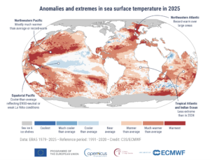
[ Ref. https://climate.copernicus.eu/GCH2025-graphics-gallery ]